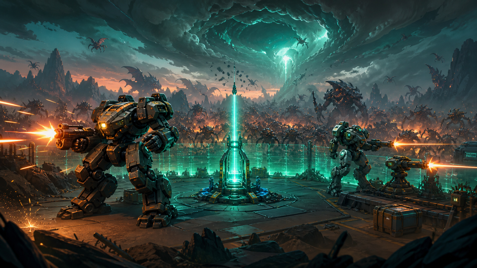
A visual roguelike has to do more than look expensive. It has to make the player understand danger through color, shape, motion, and distance. Iron Core: Mech Survivor turns neon combat into a readable language: the mech is the sentence, the perimeter is the punctuation, and the swarm is the pressure building between them.
Color is gameplay information
Glowing defensive effects can communicate safety. Warm enemy movement can communicate urgency. A bright beacon can give the player an anchor when the rest of the screen becomes hostile. These choices make the combat beautiful because they are useful, not because they are decorative.
The machine needs a silhouette
A strong mech design remains readable when surrounded by effects. That silhouette gives the player a reliable center of attention and lets the surrounding chaos become spectacle without becoming visual noise.
Why visual quality improves replayability
When each run produces a different composition of enemies, defenses, and safe ground, the player gets a new action image to read. The visual system keeps the repetition fresh because the battlefield keeps rearranging the drama.
Game features and store availability can change during development. For the latest purchase details, reviews, demo status, and platform information, check the official Steam listing.
QUICK ANSWERS
Frequently asked questions
What makes a roguelike visually strong?
Clear silhouettes, purposeful color, readable threat direction, effects that communicate state, and enough contrast that spectacle does not erase the player’s next decision.